Lobby CRE
- Apr 9, 2025
- 7 min read
Updated: Apr 23, 2025
Lobby CRE (Commercial Real Estate) is a property asset management platform for Real Estate investors, managers and analysts. Their users needed a quick performance overview of their portfolio with the ability to decipher the dense content into digestible chuck. We designed robust design systems that produced beautiful results in quick turnaround for an intense project. With our versatile UI and the ability to drill into the details through various visual tools users were able to navigate, calculate and evaluate risk hypothesis to improve profit and their overall portfolio.

"This solution has completely transformed my property portfolio—it's not just management, it's real wealth-building in action!" - Company CFO
Growth over the project
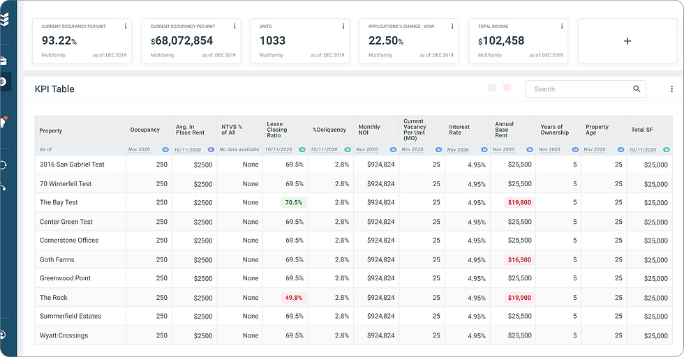
When I first joined the project, Lobby CRE was primarily focused on its core feature—the CFO Dashboard.
They were manually collecting and organizing data through Excel spreadsheets, which were then imported into their system to update graphs, calculators, tables, metrics, and charts for user visualization.
The goal was to leverage new colors and establish a basic design system, with an emphasis on functionality over the full potential of UX to create a truly dynamic, interactive platform.
While functional, the product was missing that certain "je ne sais quoi"—the visual appeal that would make it truly stand out and feel desirable.
As the product evolved, stakeholders began recognizing the value of updating the UX/UI design. The initial designs addressed the functional needs, but the real breakthrough came with the delivery of a fresh, modern UI that elevated the entire product experience.


Dashboards and Drilling in
As we were building out robust tools independently, there was an overwhelming amount of overlap between tools that we were developing In silos that users were taking away and overlapping the results with other calculations.
Lobby soon realized that despite the initial vision for Lobby CRE to be an independent CFO dashboard for Real Estate investors to be able to see and "at-a-glance"

Dashboards were set to a default dashboard but giving the user the ablity to change their metrics by changing their widgets on the dash to suit their needs. We built a widget library where users were able to built out dashboards and personalize the metrics (ie: rental capacity per property each quarter against median seasonal weather patterns) and save the dashboard for themselves in private or make it a public template for other investors to use.

Because of the drag and drop components we built in FIGMA, It put the power In the hands of each individual user, allowing them the metrics they needed to see and to tailor their alert and notifications on the subject matters that mattered to them most.
Properties & their Portfolio
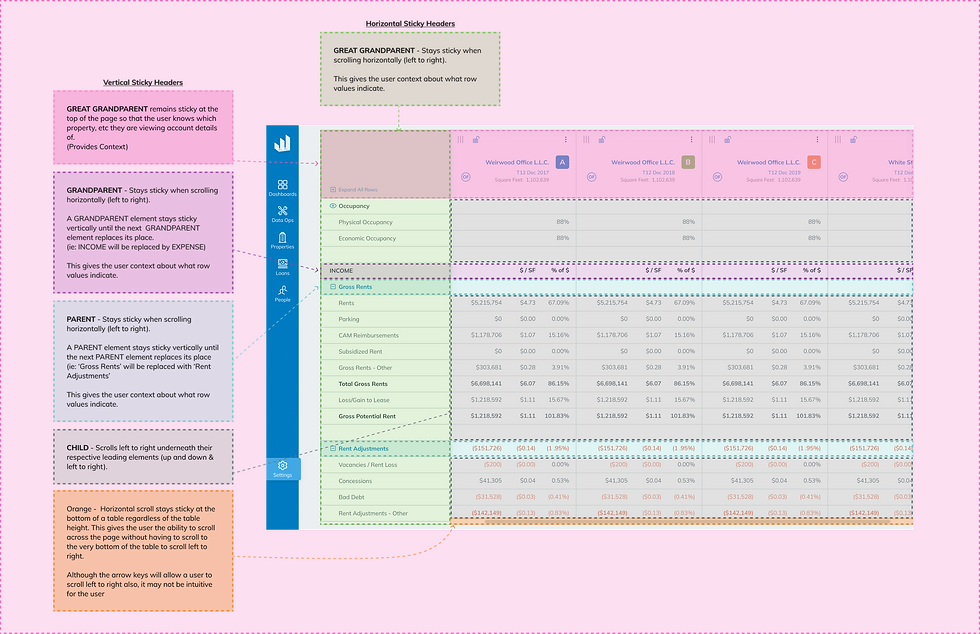
The importance of the tool was in its ability to create a clear and concise overview of their portfolio and then for them to be able to take action on the data they had or make decisions based on shifting the metrics for projected or hypothetical situations in order for them to then take action. But users also wanted to be able to see their current portfolio. So we built a section out called "properties" as a main navigation item. Users could look through their portfolio in a list, grid or map view by switching through the tabs (a common UX pattern).
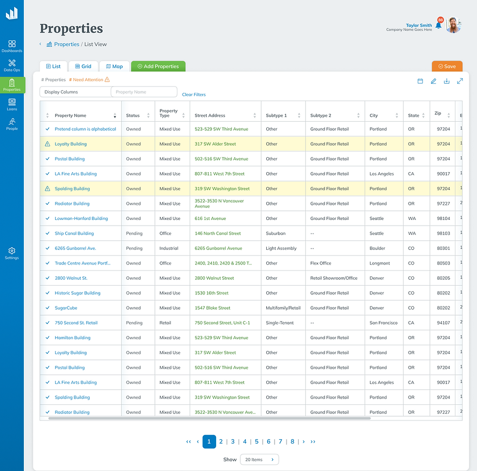
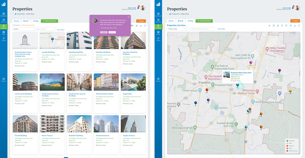
They would be able to drill into a properties details and get more information about their reports, add information, add them to their dashboard, set notifications on metrics, and other features. (Sometimes I'm sure it is probably just nice to go in and marvel at the portfolio and be chuffed! :) )
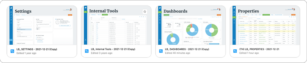
Delivering a Design System & Documentation
The design system changed over time from the basic system we started with to a super-robust tool with graphs and charts that supported heavy amounts of data. This overhaul took considerable effort for the stakeholders to listen to design and listen to the benefits of an upgraded UI. (It's hard to convince people who stare at spreadsheet data all day that there may be a better alternative) Although the overhaul was measurable - the investment saved designer time and therefore company money.
"...It may not sound like a big deal, but seeing how quickly the platform was evolving, having these as responsive components easily saved days, if not weeks, of custom work ($) for the UX team" - Chris Blanz, Designer & UX*

When I first joined, the documentation was organized by Jira ticket numbers, which made the FIGMA files long and difficult to navigate. Without clear labeling or consistent naming conventions, it was hard for new team members to locate specific features, and if a Jira or Confluence file was deleted, the corresponding FIGMA file often lost its link to relevant business requirements.
Although this was the initial approach, I began creating my own version of a more organized catalog to illustrate the benefits of a revised system. After some persuasion, we transitioned to a new documentation structure. We started organizing deliverables into design libraries that aligned with the platform’s main features, while elements unrelated to specific features were stored in the design system library.
Digging into Metrics
Feature: Property Triage A property triage table prioritizes and categorizes urgency, safety and pin-pointed metrics for a user to track In order to take action on a property. One of the features from all the daily logs that users would submit was the triage table. This was to give the user a snapshot or positive and negatives based on parameters that would be able to set the table and each column at. This allowed users to be able to address emergencies immediately while routine updates & actions are scheduled efficiently, improving the overall property portfolio. From the Triage table - users would be able to see their real data in an easier to digest visualization tool that was adjustable and then able to be snap-shot and sent to other portfolio users or managers.

Feature: Clarity in a Comparison Tool
Let's transform traditional Excel spreadsheet line items and profit & loss statements into visually engaging, easy-to-digest data by creating a robust color system that helps users navigate and find what they need. This design is perfect for users comparing different properties with varying datasets (e.g., monthly, quarterly, statement types). They can view these properties side by side for comparison, but what if they need to perform a calculation between two or even three properties?


Here is where Lobby excelled in their platform. We built out a calculator to provide, variance, and average or a total on selections of properties inline so that users could see their results in a snapshot.Users could compare their properties with third-party data with any of the above calculations and then change the numbers to see how it would change their results.


This powerful tool gave Insight to investors, managers and analysts about how certain changes may affect future projections. The results were like taking an excel spreadsheet and making it come to life, without having to figure out and manually enter the calculations.
The power of the Insights were powerful In the hand of those tho knew what they meant and meant the world of portfolio statements and future projections were left on the screen and In the hands of the user.
Adoption was quick and the feedback was stellar as we continued to add on to the features and designs as we great.Despite having such robust features, the design system supported the user though colorful designs and visual suggestions to help the user navigate
The Data Collection
Internal Problems: Capturing users data - functionality vs. frills
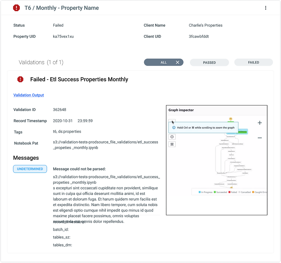
Our internal team were ingesting masses of data each day with our users portfolio reports being Ingested daily through a funnel built by our backend team using AWS. This made the process swifter than manually requiring users to copy and paste data into the system to get the system outputs however this was tedious and we needed a way to make sure documents were being parsed correctly so the right data would fill the metrics inside the platform.
The issue was when the data wasn't being ingested properly. (Ie: the file didn't come through at all, it was missing information, it had incorrect information or any other issue with the file)
Our onboarding teams wanted our clients daily data to be able to be set up at the end of day - like clockwork so that the data would be ready before next business day.
It didn’t have to be pretty for our employees - it had to be functional.
The problem was is that the way that developers saw the process of uploading financial data from a spreadsheet had to be processed, sorted through and then delivered.
Our developers could log in and crunch through the issue, but this took time and energy and to staff the company with people who could see the issue from the "crunchy" AWS system.


But if the team was required to contact the user didn't have a list about what the problem was which would give the user a direct way of pin-pointing the situation, mitigating it and resending the file back over. Or if it was a data ingestion issue on our server side. Our employee experience teams wanted to know where in the process the upload and progress was so that they would be able to alert the client when the data would be displayed or alert the user that there were errors that needed fixing in order to output the data correctly.
I was tasked with Building a data ingestion pipeline for uploading data, parsing it out and then making it come to life inside the app. (This is the ugly part - This is the piping behind the bathroom walls - before the pretty finishes.) The goal was to
Know where the issue was immediately without having to search for it
Give the data ops as much visibility ASAP so they can fix the problem
Once they have fixed a problem - alert the user If needs be (resend the data) or clear the Issue and restart the Ingestion pipeline process with the click of a button.